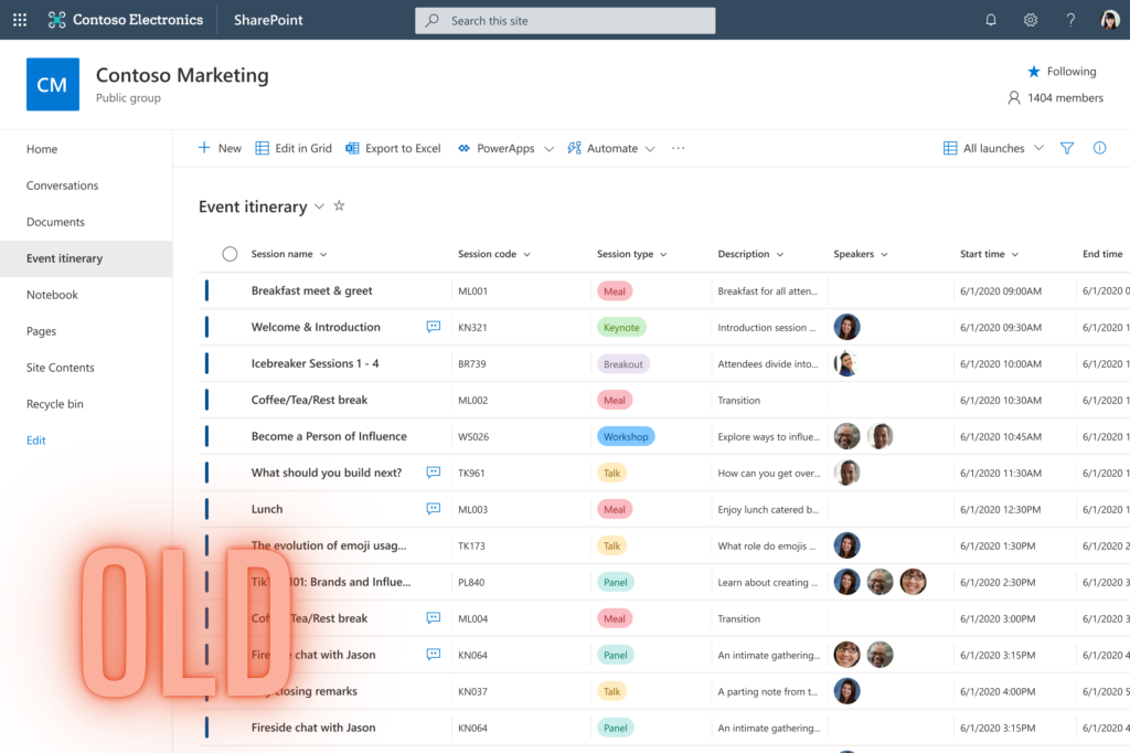
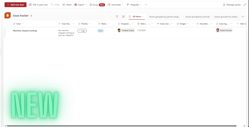
Since the beginning of July, we can observe that the old graphical interface of lists and document libraries has changed. Now, views and grouping options are much more prominently displayed.

A very important change is the highlighting of views. I feel that until now, this feature was too hidden, and many users who were new to SharePoint couldn’t intuitively use the views.
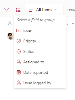
Additionally, the grouping of items is now more prominent. This was also an option that used to be hidden.
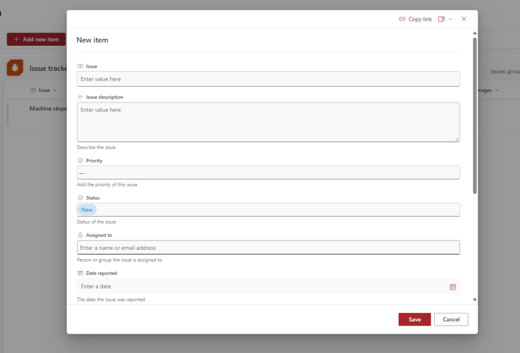
The interface for adding and editing items has also changed. To me, it is now much clearer!
I know the new view also causes some problems – but hopefully, these will be fixed soon. Do you prefer the old or the new look?

__________________
Would you like to benefit from consultations dedicated to Microsoft 365, Power Platform, Azure solutions, or would you like to build your Intranet in a very unique and personalized way? Take advantage of the services of the company I have the opportunity to work for! Our specialized team will certainly be happy to listen to your needs and take care of them!
If you have any questions, feel free to contact us.

