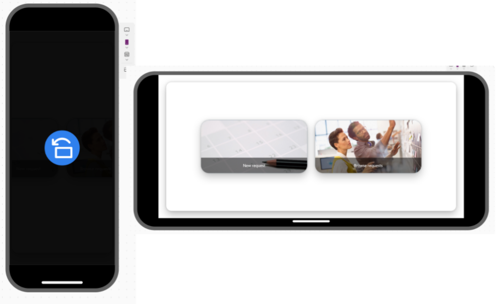
If you are building a responsive app designed for a single phone orientation (e.g., horizontal), you need to secure it and inform the user when they launch the app in portrait mode. This method will also work if someone is using a personal computer with a rotated screen, such as a 9:16 aspect ratio.
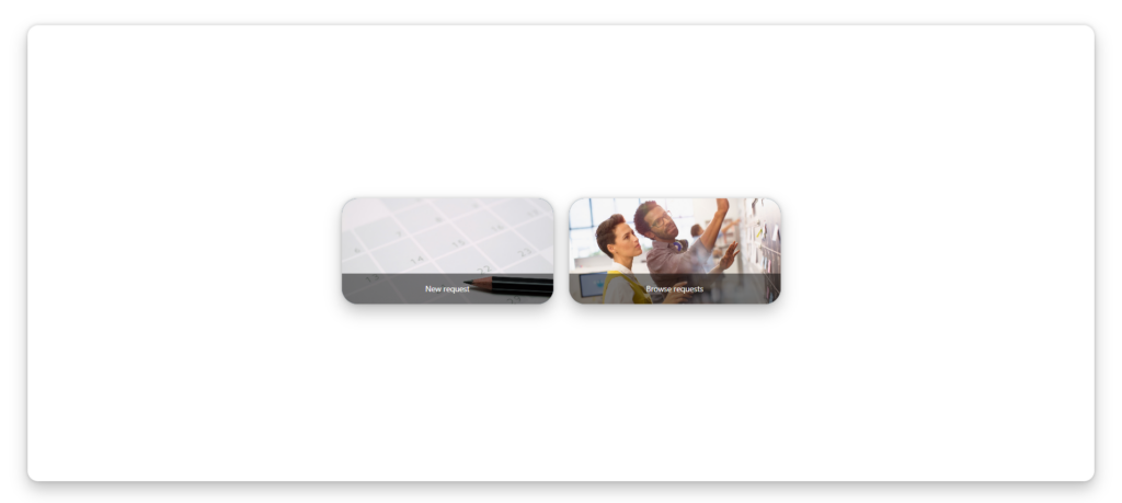
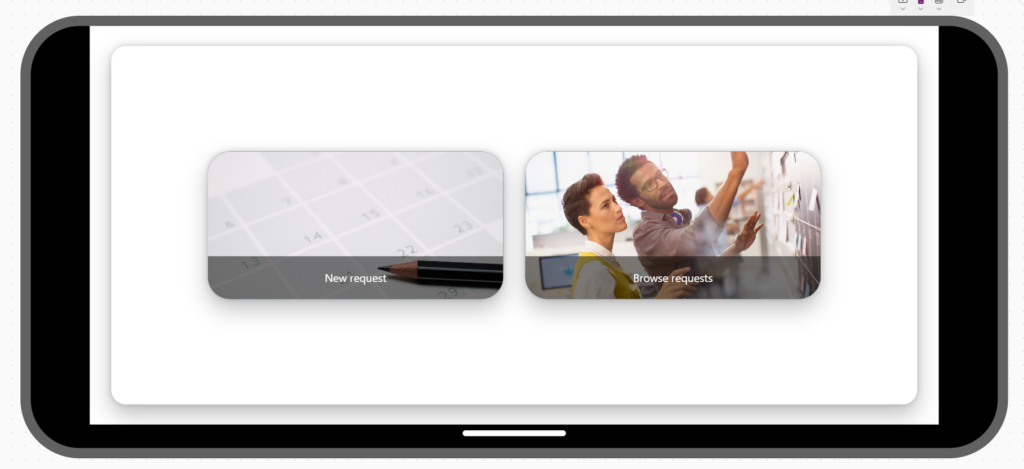
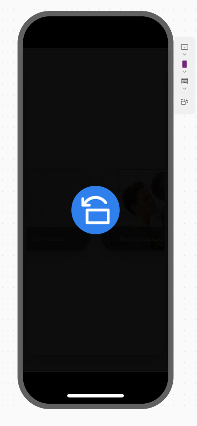
To achieve the desired effect on every screen, you need to add two controls: a Rectangle and an image with a graphic showing the phone’s rotation.
Set the Height and Width properties of the rectangle to Parent.Height and Parent.Width, respectively.
Set also Fillto Color.Black
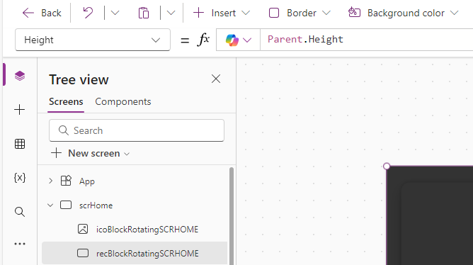
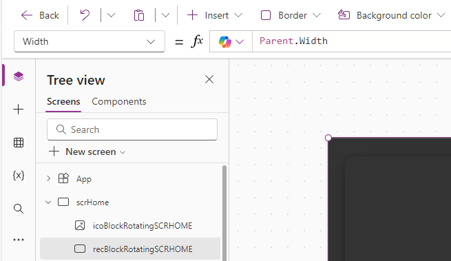
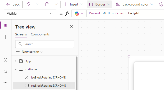
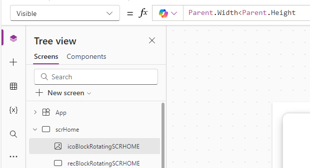
The most important step is to create a condition that displays the blocking rectangle only when the screen’s width is greater than its height. To achieve this, set the Visible property to:
Parent.Width < Parent.Height
The second step is to add an image symbolizing information for the user about the need to rotate their phone. I used the one shown below.

Add an image and place it above the rectangle.
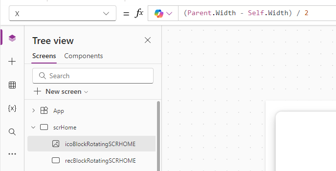
Set the X property to:
(Parent.Width – Self.Width) / 2
Set the Y property to:
(Parent.Height – Self.Height) / 2
The above settings will ensure that the image is always displayed in the center, regardless of the screen resolution.
The last thing is to set the visibility, exactly the same as for the rectangle.
And that’s it! From now on, your responsive app can only be launched in landscape view.
__________________
Would you like to benefit from consultations dedicated to Microsoft 365, Power Platform, Azure solutions, or would you like to build your Intranet in a very unique and personalized way? Take advantage of the services of the company I have the opportunity to work for! Our specialized team will certainly be happy to listen to your needs and take care of them!
If you have any questions, feel free to contact us.

