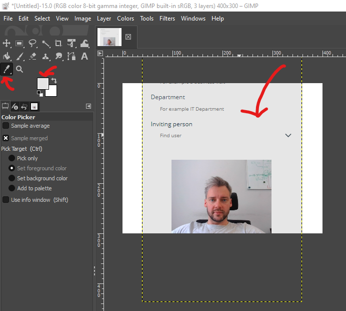
When I implement solutions, I try to make my applications graphically nice looking, if i can’t find an out of the box option I’m using the MEDIA option – it is really powerful because sky’s the limit. Just imagine how your background/button/icon/form should looks and then create it in PhotoShop or GiMP or just buy/download media from external sources.
In PowerApps there is often no division into frontend and backend developer – one person must remember about both things, people often buy(or like) things that are nice looking.
But what if I can’t use PhotoShop or GiMP?
Surely you know modern applications with a very minimalist design – do not be afraid of changing component properties like border, color or font. In my opinion, a really powerful option is transparency! Just add a rectangle button and set 80% transparency – it will look really modern. Sometimes just fill your button transparency and set border 3px, color it and it looks really fashionable (screenshot number one).
Below are some examples of non-standard/unpopular UI interfaces/option as I implemented.
Example above is a Stock Photo with added black gradient (better contrast for buttons) in PS/GiMP from the top and from the down. Black gradients additional will simulate the responsiveness of the application (Android or iPhone menu button will be looks like integrated with PowerApps App).
Example above shows us that classic Button (Flows/Apps) can be modified and looks really modern/custom. Search box too – few changes and it is hard to verify that it is PowerApps app :- ). Nice option is adding optionally custom, animated loading bar image.
Other example Home Screen Design (There is no Photoshop), just custom Icon with Security Guard, APP in PL language – sorry :).
And alternative for Toggle Switch – two icons in two color variants. Appropriate variables in the onselect parameter and it’s ready – it pleases the eye.
What do you think about UI/UX in PowerApps, write a comment!
